True colours
The making of Sophie Smallhorn’s small, large, bright and beautiful artworks
Words: Kassia St Clair
Photography: Ruth Ward
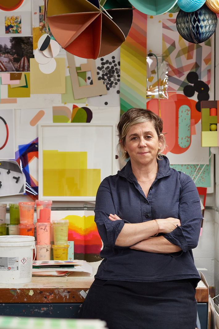
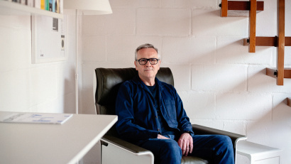
Meeting Sophie Smallhorn, you are struck by a sense of dissonance between art and artist. Whether in the form of sculpture, site-specific installations or prints, her work is poised, composed, self-possessed. Sophie herself seems less assured. When asked her occupation by a bank employee, she sounded so apologetic when saying ‘artist’ they asked if she wanted to give a different answer. She is uneasy thinking about standing up in front of a panel, giving speeches, or pitching for new commissions. She confesses that because she’s not fine-art trained, she feels she lacks the proper language to speak about her art, qualifying that her work is “design-led” and that her background is as a maker.
When it comes to her process, however, any hesitation vanishes. “This is my comfort zone. The place I go back to when nothing is as it should be, and no projects are happening. There is just no doubt in my mind that I can bring a body of colours together and make that piece of work” she says, then pauses, looking a little startled.
Even if you can’t quite place the name, you are likely to be familiar with Sophie’s work, which playfully explores colour, volume and proportion. Active since the late 1990s, she has been shown everywhere from the CASS Sculpture Park near Goodwood in England, to the Comme des Garçons flagship store in Tokyo via Colette in Paris. As this suggests, the scale at which she works has varied enormously.
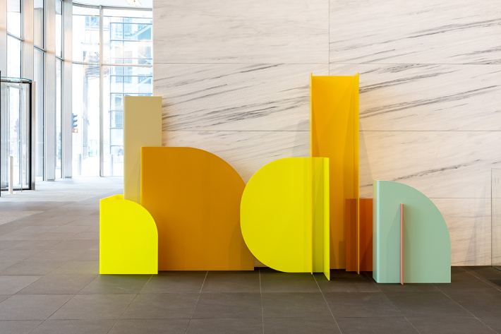
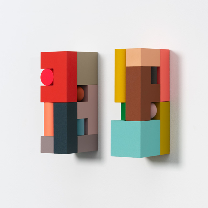
In 2012, working with the architects, she arranged the palette of colours for the fabric wrap covering the exterior of the London Olympic Stadium, but she’s perhaps better known for small screenprints and hand-sized shapes, often wall-mounted compositions of small, colourful blocks. Elsewhere in London, her prints have appeared at several Royal Academy Summer Exhibitions, a sculpture composed of powder-coated aluminium panels graced the lobby at 100 Bishopsgate and arrangements of her brightly painted stripes adorn two walls at Canary Wharf tube station.
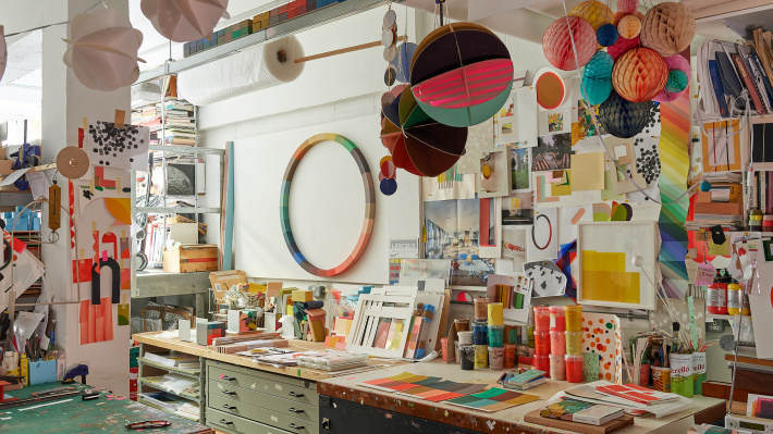
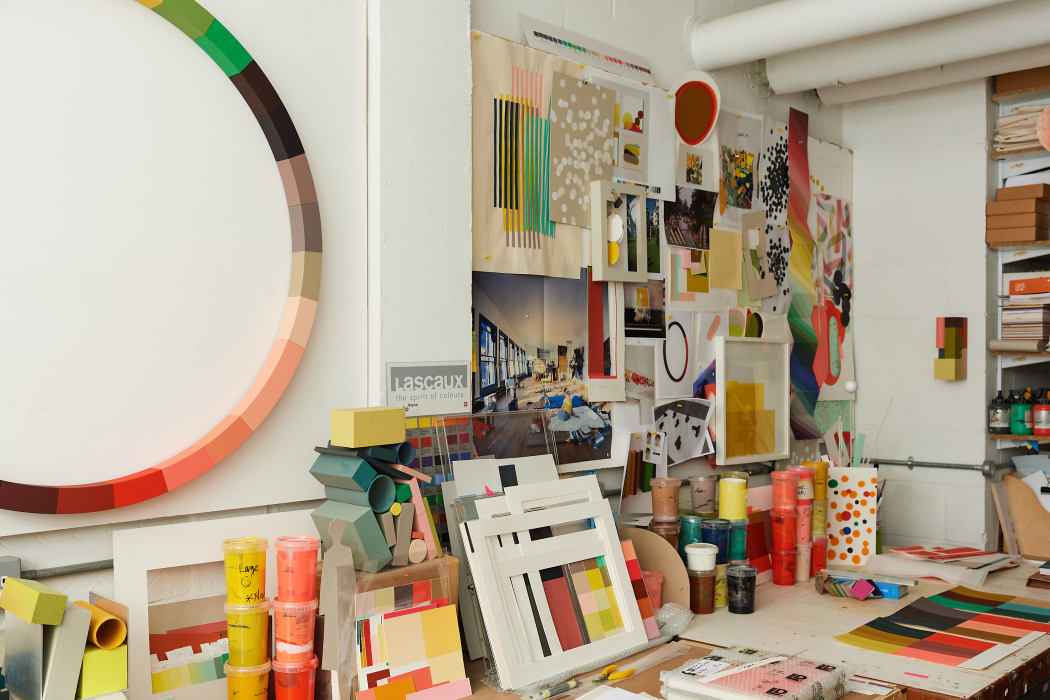
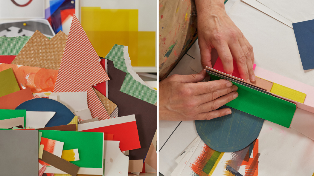
Although Sophie’s studio is a subterranean lock-up with whitewashed walls, the impression is of a space awash with colour, much of it in shades of California poppy, scarlet and – her favourite – Camino red. Some of this comes from works-in-progress, which hang on the walls, plus a chromatic jumble of swatches, and odds-and-ends that she has collected as a sort of ad-hoc colour-reference library. She finds this useful as a way of starting a new piece: she can rummage through the collection, lay out various samples and think about the way the colours go together. It’s an intuitive way of working that reflects both to her early childhood and the beginning of her practice.
She grew up in Cambridge, England, in an expressive, visual household. Her father was an industrial designer while her mother designed textiles; both actively encouraging her creativity. She went to art school in Brighton, studying for a degree that was “a bit like an extended foundation course” called ‘Wood, Metal, Plastics and Ceramics’.
Moving to London after college she began working as a jobbing carpenter, but continued to make small, sculptural pieces from off-cuts, something she’d started alongside her larger projects at college. Creating them was far more interesting to her than making furniture. “There was an immediacy to it. They were a contrast to these great long laborious furniture projects: a relief, really. I would collect all the bits and make something in a day that was more joyful, more playful, with no agenda.” She held an exhibition in her flat and built from there, getting first a show in a space in Notting Hill and later a gallery. “That was the first point where I felt like someone had said ‘Okay, this is what you are. I am going to legitimise this.’”
No matter what the piece, whether it’s commissioned or just speculative, Sophie begins by establishing a set of parameters or rules for herself. “Complete open-endedness is a bit overwhelming, so I establish an edge to work from.” This ‘edge’ can be a very illogical set of rules, like having to only think about the spaces between the elements rather than the elements themselves, or not using certain colours. “It’ll just be a sort of a small restriction, which makes the launch less… well, less terrifying.” A favourite restriction is Camino red because she gravitates towards reds and pinks so much in her work.
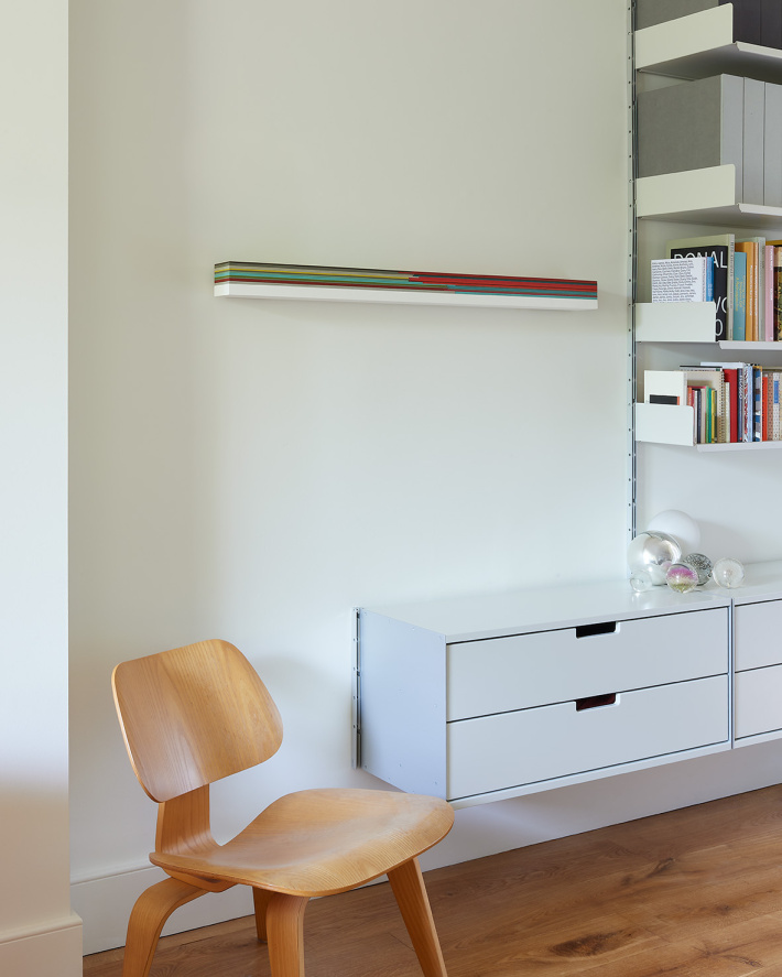
Sophie often photographs smaller works in her home. “When you take work out of the studio clutter and experience it within a home, the piece can breathe a bit, and you start to see new things about it. If you don’t know the work, it can be difficult to get a sense of the scale. Photographed within a setting where you can reference a book, a shelf, or a chair can sort of ground the piece. My work also has a particular reference to domesticity, so it works to see them within that context”
For Sophie, colours have different volumes – some seem to almost physically occupy more space than others – but also different comfort levels. She balances each against one another to achieve a satisfying whole. “It can’t just be all nice colours, there has to be something that slightly jars or pushes against the other elements. There’s got to be some discomfort there. It’s like a great cocktail party: you need a rogue element.” She always knows the exact moment that a piece is complete, when the perfect mix of hues and shades in just the right proportions has been found. “It’s a sweet spot. A sense that things are just as they should be in that moment,” she says. “That feels like quite a confident declaration, doesn’t it?”
