Signs of life
The pictograms by Wolfgang Schmidt, who was Vitsœ’s graphic designer for almost 30 years.
Words & Photography: Vitsœ
The graphic designer, Wolfgang Schmidt (1929-1995), was known as a messy student. Yet the clarity and precision of the work he left behind is quite the opposite. His friend, Hans Hillmann, said of Schmidt, whom he remembered one winter holding his coat wrapped around him because all of the buttons had fallen off, “It was astonishing to us that the final result, the finished graphic was, including a large white border, absolutely immaculate when he showed it, without a speck of dust unless he had planned it.”
Schmidt was influenced in the 1950s by the treatment of light and dark values in the linocuts and engravings of the artist and professor, Karl Rössing, who taught him at the State Academy of Art in Stuttgart. Schmidt went on to learn how to organise text and images on a page with Hans Leistikow in Kassel; and in Reykjavik, Iceland, he met Dieter Roth who invited him to play with type.
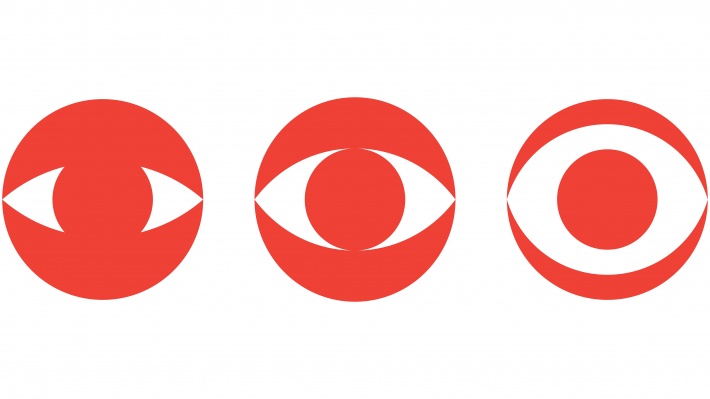
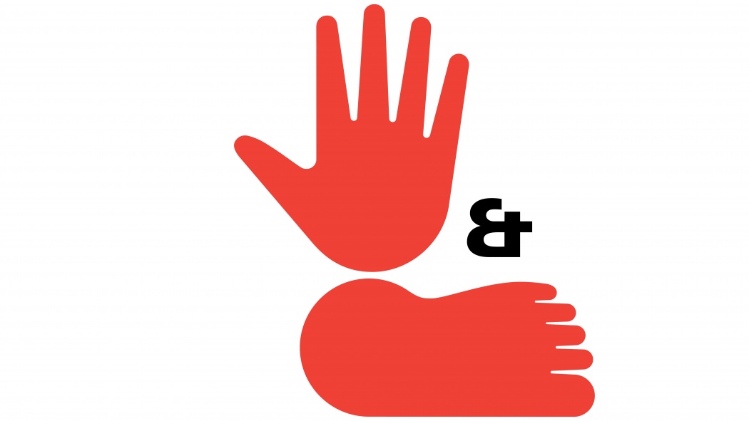
It was at the beginning of the 1960s that Schmidt started to work with Niels Vitsœ, shortly after the founding of the furniture company, Vitsœ + Zapf. Schmidt’s task, in his words, was to create, “a system for the holistic and concise design of all visual expressions of an institution with the aim of achieving the best possible communication between sender and receiver.” In 1969 he adopted Adrian Frutiger’s Univers font to design Vitsœ’s logo that has not changed since. In 1971 Schmidt developed the ‘hand and foot’ pictogram specifically for Vitsœ. In German there is an expression to say something has “hand und fuß”, which means that it has been thoroughly thought-out. Hand and foot was central to Vitsœ’s identity during the 1970s.
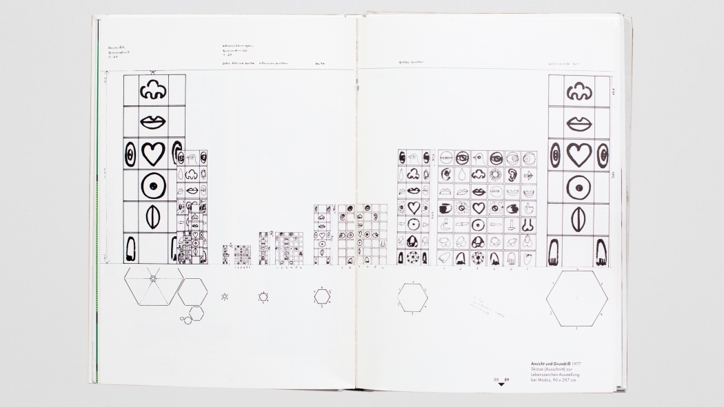
Schmidt’s pictograms known as ‘Lebenszeichen’ (‘Signs of life’) were designed as a personal project in 1972 to represent, as he put it, “almost all human experiences.” While he acknowledged the impossibility of his task, he described the creation process as, “a game that follows strict rules.” Based on parts of the human body he designed a system that allowed the discovery of new forms via the reproduction and iteration of motifs. Over 260 pictograms followed; it was rumoured that he planned 893 in total.
Typically for Schmidt, he did not confine his work just to the obvious eye, ear, mouth, hand and heart but added the vagina, penis and testicles. He used a minimum of marks to make each pictogram while retaining a character that draws a smile from even the most reserved viewer.
Mark Adams, managing director of Vitsœ, who worked with Niels Vitsœ from 1985, commented on the relationship between Vitsœ and its graphic designer: “Niels and I bonded over our dry sense of humour and I’m sure it was similar between him and Schmidt. You can see it in the graphic design and the written messages they exchanged. They were nudging at the edge of what was acceptable at the time. For all their prim exterior appearance they were cheeky and irreverent behind the scenes. The playfulness was a good antidote to the seriousness in the so-called design world.”
Schmidt was interested in the process of design rather than the pursuit of a personal vision. Almost unwittingly echoing the ethos of his client, he once said, “Arbitrary interventions to achieve a more beautiful look are forbidden!” He continued to design for Vitsœ for nearly three decades before withdrawing from public life in 1987. He was declared dead in 1995.


