The road to Royal Leamington Spa: a new way of building
The unconventional design process behind Vitsœ’s new building in Royal Leamington Spa, England.
Words: Vicky Richardson
Photography: Vitsœ
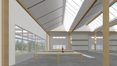
Stepping inside, without knowing anything about the unconventional design process behind it, I immediately sensed that this is a new kind of building. It isn’t merely a question of scale (it is a vast 135m long, 25m wide and 6m high), but it is a feeling given by the extraordinary quality of daylight. Lux levels are at 1000 most of the time, which is higher than building regulations require, and will avoid the use of artificial light even on a dull day. The saw-tooth profile of the roof protects the inside from direct sunlight, except the magical slivers of light that are allowed in for six weeks in May and June due to the orientation of the building in relation to the sun.
Vitsœ’s beautiful shed defies the conventional distinction between ‘building’ and ‘architecture’ set out by Nikolaus Pevsner in his 1942 book ‘An Outline of European Architecture’: “A bicycle shed is a building; Lincoln Cathedral is a piece of architecture. Nearly everything that encloses space on a scale sufficient for a human being to move in is a building; the term architecture applies only to buildings designed with a view to aesthetic appeal.” To my mind this is a glorious piece of architecture, though it was not designed by an architect nor was it designed primarily for aesthetic appeal.
Creating its own production building and headquarters was a chance to extend the principles behind Vitsœ’s 606 Universal Shelving System to the scale and complexity of a building. Managing director, Mark Adams, describes Vitsœ as a service company that happens to make a product. People – both staff and customers – are at the core of what the company is about. This humanist principle has played out in the creation of the new headquarters, where the effect of the building on its occupants has driven the design. In the process, Vitsœ has challenged the norms of the construction industry and broken away from the fixed professional roles that so often hinder rather than nurture ideas.
Even before assembling a team of building professionals, Adams had a strong vision of how Vitsœ’s building would feel and how it would be built. He had visited the gallery Dia:Beacon in upstate New York (a former 1932 Nabisco box-printing factory on the Hudson River) where the quality of light and fine detailing were confirmed to him as essential attributes for Vitsœ’s new building, despite the push-back from the industry. He and his artist wife had also seen how simple kit-buildings work at a small scale after refurbishing an army hut in their garden to make a studio.
Neither Dia:Beacon nor the army hut were designed with aesthetic appeal in mind, which disqualifies them from being ‘architecture’, according to Pevsner. But their simplicity, fine detailing, quality of light and soaring volume gave Adams the idea for a loose-fit, universal building where all Vitsœ’s varied activities would co-exist under one roof.
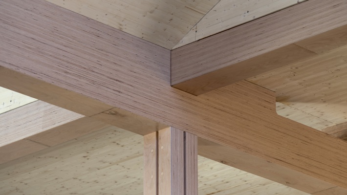
While visiting a trade show in Germany, Adams was inspired to use engineered beech timber, and became fascinated by high-load mechanical joints and the structural properties of laminate-veneer lumber (LVL), which hasn’t been used before on this scale in the UK. Another key inspiration was the landscape of the 1972 Munich Olympic Park. Although the park is better known for the experimental architecture of Frei Otto and Günter Behnisch, one of its most successful aspects is the integration of the buildings within an undulating landscape designed by Günther Grzimek. Adams picked up on the use of cobbles set within grass, which has been directly applied in the landscape of the Vitsœ site in Royal Leamington Spa.
With ideas taking shape for the structural concept, quality of light, environmental performance and landscape, Vitsœ began to assemble the team that could deliver such a universal building. Environmental engineer Mark Skelly, Founding director of Skelly and Couch was the first to come on board, closely followed by landscape architect Kim Wilkie.
Skelly describes how he was immediately interested in the idea of making a building as if it were Vitsœ’s furniture: “A building is certainly more complicated, but through determination and an iterative process, we’ve ended up with a clear, simple, elegant design which reflects Vitsœ’s product.” Skelly emphasized that the work of a services engineer, far from being about pipes and wiring, is about the health and well-being of occupants. “Daylight, acoustics, ventilation are all critical to that and were the driving principles for the design,” he said.
Next to join the team – following a fortunate introduction by a customer – was Martin Francis, a marine architect and super-yacht designer who had worked with Foster + Partners for 20 years before setting up the pioneering engineering firm RFR with Peter Rice. Francis shared Adams’s passion for the Victorian master builders, and particularly Joseph Paxton (inventor, architect, and head gardener at Chatsworth House). Paxton’s 1851 Crystal Palace with its cast-iron modular and demountable structure, which did not require interior lighting thanks to the discovery of cast plate glass, became another touchstone for the Vitsœ building.
Francis introduced engineer James O’Callaghan of Eckersley O’Callaghan, a renowned expert in the design of glass structures, and with Waugh Thistleton as delivery architect and adviser on the use of engineered timber, the team was complete. Despite the unusually organic appointment process, the team was united by a commitment to responsible design. Perhaps more importantly, they were open-minded enough to embrace a new way of working and to set aside preconceptions about the highly-regulated roles of conventional construction. As Waugh commented, “the fascinating thing about working with Vitsœ is that Mark has made us reflect on our own industries and why we put up with such poor quality generally.”
Francis, who has designed superyachts larger than the Vitsœ building, was not phased by its scale and embraced the possibility of creating a space that could be reconfigured to suit the company’s changing requirements. Flexibility was a key consideration given that Vitsœ expanded eight-fold in its previous building, and wanted a home that would support rather than hinder its future growth.
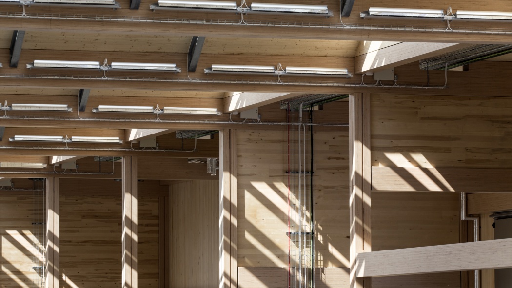
The design of the roof determined the building’s character and the quality of light. Rooflights were stretched to maximize the light, and after much discussion with O’Callaghan, a simple steel I-beam was used to support the roof instead of the timber trusses that had originally been part of the design. Gazing along the length of the space, the 18 bays of the grid and the resulting pattern of beams create a satisfying visual rhythm. Surveying the building on site at the end of the process, the design team was full of praise for the sub-contractors and the quality of materials: smoke detectors and cabling has been installed with precision so that it appears decorative, a polished concrete floor is the result of great craftsmanship, and wood-fibre wall insulation is being used as wall dividers.
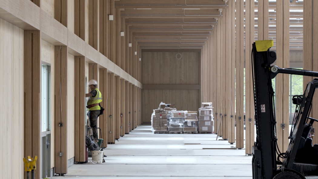
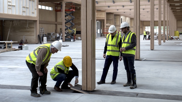
Francis speaks of the design almost as if it were church architecture: the central space is the nave, while timber columns divide off two outer aisles, which can be subdivided into pavilions to accommodate different functions. A picture window at the north end frames a still life of woodland animated by the occasional train zipping past. The spectacular scale of the space is matched by its precise detailing. Vitsœ constructed a 1:1 mock-up to test the design of the foot of a column where it meets a service channel in the floor. Vitsœ also designed plywood channel covers with handle details to match those on its 606 Universal Shelving System cabinets. Tellingly, this small detail, which is the key to simplicity and flexibility, is one of the features Vitsœ is most proud of.
But the story doesn’t end here. Since early June, Vitsœ has been producing and exporting from its new headquarters. In the run-up to the official opening later this year the building will be completed by various work areas being installed throughout the building, the display of Vitsœ’s almost 60-year archive in an exhibition space, a professional kitchen serving tea and lunch to the whole company in a canteen and visitors occupying mezzanine apartments. How Vitsœ learns to inhabit this universal space will be just as fascinating as the making of it, I suspect.
